Stop me if you’ve seen this one before…
You walk into a boutique in Milan—one of the fashion capitals of the world—and all you see is black. Black trousers. Black dresses. Black coats. At first glance, it looks chic… until you realise it also looks like everyone’s in uniform.
It’s safe. It’s easy. And it means no one risks getting colour “wrong.”
But here’s the problem: living in black might feel like a shortcut to style—but it’s also a shortcut to looking flat, washed out, or just... invisible.
Colour, on the other hand? It brings life to your face. It makes your skin glow. It lifts your mood and makes you look pulled together with zero extra effort.
But if you’ve ever put something on and thought, “Why does this make me look tired?”—you’re not alone. That’s where understanding your skin’s undertone comes in. And even better? Knowing the universal colours that flatter everyundertone, so you always have a sure thing in your wardrobe.
You don’t need to study colour theory. You just need a few clever tips—and that’s exactly what you’ll get in this guide.
Let’s get into it.
✦ WHY COLOUR MATTERS MORE THAN YOU THINK ✦
You might think colour is just about taste. You like navy. You hate orange. You feel safe in black. That’s fine—until you realise some colours do more than just match your mood. They change how your skin looks. How awake you appear. Even how confident you feel.
Colour is one of the easiest tools you have to light up your face, bring out the glow in your skin, and make your outfit feel intentional—not accidental.
Wearing the right colour can:
Make your eyes look brighter
Boost your skin’s natural glow
Create that “put-together without trying” look
The wrong one? It can make your skin look dull, your eyes look tired, and your outfit fall flat—even if the cut is perfect.
But here’s the good news: you don’t need to decode your undertone to wear colour well. Some colours are universally flattering. They sit perfectly in that sweet spot between warm and cool—and almost always look great, no matter your complexion.
Let’s look at what those colours are—and how to use them to your advantage.
✦ THE MAGIC OF UNIVERSAL COLOURS ✦
Not all colours are created equal. Some only shine on certain skin tones—but others? They’re pure magic. These are the universal colours: the shades that somehow flatter almost everyone, no matter your undertone, hair colour, or how much sun you’ve had.
They strike the perfect balance between warm and cool tones, meaning they don’t fight your skin—they lift it. These are the shades that make people say, “Wow, you look amazing,” even if you’re just wearing a simple dress or a beach wrap.
Here’s your go-to list:
1. Teal
It’s the colour that loves everyone. A perfect blend of green and blue, teal flatters both warm and cool complexions. Bonus: it looks incredible against sun-kissed skin, making it a staple for resort wear.
2. Turquoise
Like teal’s breezier sister, turquoise adds brightness and clarity to your look. Whether it’s a flowing kaftan or a bikini trim, it lights up the face and feels like summer bottled into a colour.
3. Navy Blue
It’s softer than black and easier to wear. Navy gives you polish and depth without washing you out. It works for day or night and pairs effortlessly with bold accessories or neutrals.
4. White (yes, really)
Not all whites are created equal—some have cool undertones, others are warm—but most people can wear a clean, bright white. It freshens your look instantly. Think: crisp white shirts, breezy linen trousers, or a white sundress on holiday.
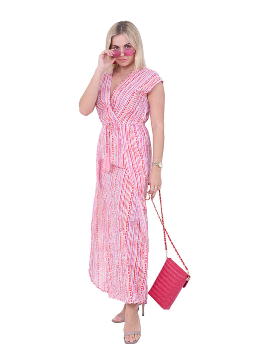
5. Pastel Pink
Surprisingly versatile, soft blush pink adds a healthy glow and works with both cool and warm skin tones. It’s especially flattering in floaty, lightweight fabrics.
6. Red (with a twist)
True red—neither too orange nor too blue—looks great on almost everyone. If you’re unsure, look for reds labelled “classic,” “neutral,” or “poppy.” A bold red swimsuit or sundress? Timeless.
7. Eggplant Purple / Periwinkle
These underrated tones add sophistication without overpowering your features. They act almost like neutrals, letting your face do the talking.
8. Taupe
It may sound boring, but taupe is the ultimate soft neutral. Not too warm, not too cool—just right. It’s a subtle base for layering bolder accessories or prints.
Think of these as your colour safety net. If you’re ever unsure, reaching for one of these shades is a smart move. And at Acqua Bonita, you’ll often find these hues woven into our collections—because we know you want to pack light, dress smart, and feel radiant wherever your resort days take you.
✦ HOW TO USE UNIVERSAL COLOURS WITH STYLE ✦
You’ve got the list. Now—how do you actually wear these colours with style and ease?
The key is to use them as your wardrobe anchors. When you're packing for a trip or browsing new pieces, start with universal colours. They’ll work with you—and with each other—giving you an effortless, pulled-together look every time.
Here are a few smart ways to make them work for you:
1. Build a base with them
Use universal colours for your core items: a pink maxi dress, black soft trousers, an aqua kaftan. These are your “never-fail” pieces you can style up or down.
2. Let them frame your face
Wearing universal shades near your face—like in tops, scarves, or swimwear—will bring out your glow. That’s where colour has the most impact.
3. Mix them like neutrals
Colours like taupe, navy, and eggplant are incredibly versatile. Use them the same way you’d use black, beige or grey—but with more warmth and personality.
4. Add your personal flair
Just because a colour is universal doesn’t mean it has to be basic. Pair pastel pink with bold earrings, or layer white with a printed kimono. Let your accessories or makeup reflect your vibe.
5. Use them when you're unsure
Not sure what the lighting will be like at that dinner by the sea? Or unsure what your tan will look like in a week? Universal colours are your safety net. They flatter in any light, on any skin.
At Acqua Bonita, we work with universal tones like teal and turquoise on purpose—they’re beautiful, beach-ready, and make you look alive in the way that black simply doesn’t.
✦ COLOUR CONFIDENCE, THE ACQUA BONITA WAY ✦
Here’s the truth: wearing colour shouldn’t feel risky. It should feel joyful.
And universal colours are your way in. They’re reliable, flattering, and the perfect way to elevate your look without overthinking it. Whether you're beach-bound or brunch-ready, slipping into a piece that lights up your skin is a kind of everyday magic.
At Acqua Bonita, we don’t choose colours by chance. Every shade in our collections is carefully selected to make us look radiant and feel lifted—not just in how we appear, but in your mood, too.
Because we believe resort wear isn’t just for holidays. It’s a mindset. A feeling. And when you wear colours that flatter your skin and brighten your day, you carry that glow with you—no matter where you are.
That’s why you’ll always find tones like turquoise, teal, white and blush pink throughout our pieces. They’re more than just pretty—they’re powerful. They make you feel put-together, confident, and like you’re on holiday... even on an ordinary Tuesday.
So next time you're getting dressed, skip the black. Try colour. You might be surprised how good it feels.
Thank hue.