For years, many of us dismissed pink.
Too feminine.
Too delicate.
Too soft.
A color associated with childhood, sweetness, and a version of womanhood that felt a little too boxed-in. A color we avoided because it didn’t seem “serious” enough… or because we feared it would draw too much attention.
But somewhere along the way, something shifted — in fashion, in culture, and in us.
Pink made a quiet comeback. Not the cliché version we grew up with, but a modern, confident, grown-woman shade that feels refreshing, elevated, and unmistakably powerful.
At Acqua Bonita, we’ve seen this transformation firsthand. Season after season, no matter the destination or the mood of the collection, pink always finds its way in. It’s the color women try on “just to see,” only to discover it brightens their whole face. The dress they pick for a special trip. The pareo they pack for every beach escape. The top they reach for when they want to feel radiant without overthinking it.
So if you still think pink is “too feminine,” “too much,” or “just not you,” this guide was made for you.
Here’s why we believe pink is one of the most powerful colors you can wear — and why it holds a permanent place in the Acqua Bonita world.
1. Pink Enhances Your Natural Glow
One of the secrets your camera and your mirror already know: pink is incredibly flattering on the skin.
Pink reflects light softly yet vividly, adding warmth and luminosity to your complexion — especially under the sun. If you're someone who gets even the slightest summer tan, pink becomes the perfect companion. It picks up those golden undertones and enhances them effortlessly.
The trick isn’t about being a “pink person”; it’s about choosing the right shade for your skin’s undertone:
- Warm undertones shine in peachy pinks, corals, and warm rose.
- Cool undertones come alive with soft blush, dusty pinks, and blue-based pinks.
- Neutral undertones can move freely between both families — a privilege few colors offer.
At Acqua Bonita, we always keep undertones in mind when curating our fabrics. We choose pinks that make you look naturally rested — the kind of hues that make people say, “Did you just come back from vacation?” even when you didn’t.
Pink gets you that built-in glow, and that’s your power.
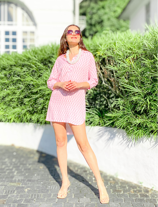
2. Pastel Pink Looks Good on Everyone
There is one shade that deserves a crown: pastel pink.
Stylists often refer to it as a “universal color” — a rare hue that flatters almost every skin tone, age, and personal style. There’s something inherently calming about it, a softness that doesn’t overpower but instead enhances.
Pastel pink has this unique ability to make a look appear fresh, polished, and quietly sophisticated. Even men with a pastel pink shirt often look surprisingly great— proof that the color is not limited to one gender or style.
For resort wear, pastel pink is a dream:
- It feels light under the sun.
- It softens bright backgrounds like sea blues or palm greens.
- It gives a gentle lift to tired skin.
- It transitions beautifully between seasons.
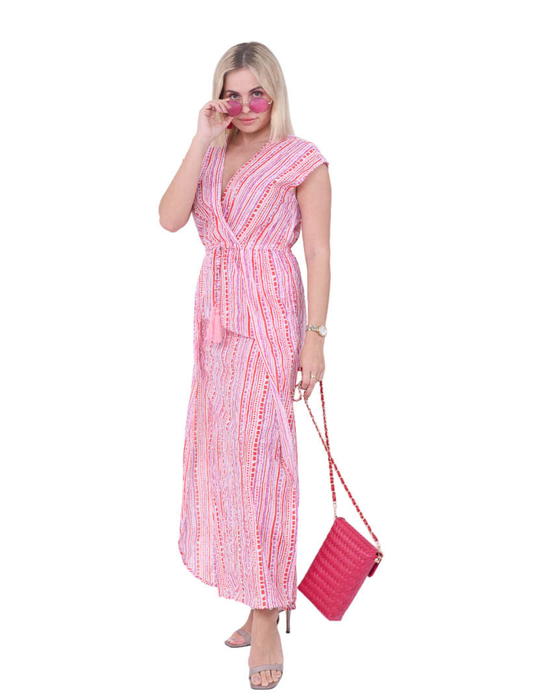
Whether you’re wearing a flowy midi dress, a pareo at the beach, or a simple camisole for a relaxed afternoon, pastel pink has a way of making you look put-together with zero effort.
3. Pink Pairs Effortlessly With Neutrals
Pink is surprisingly easy to combine.
Pair it with your favorite white linen, and it becomes freshly Mediterranean.
Add gold jewelry, and it leans elegant and sun-kissed.
Combine it with natural textures like raffia, macramé, or woven totes, and it channels a soft, effortless resort vibe.
This is one of the reasons pink is a key player in our collections:
It integrates seamlessly with the entire resort palette.
- White, cream, and beige? A perfect match.
- Tan leather accessories? Flawless.
- Brown or caramel sandals? Warm and elevated.
- Gold hoops or pearl earrings? Always a yes.
Pink doesn’t compete with your neutrals — it completes them.
This makes packing for a trip incredibly easy. Instead of adding loud prints or colors you need to “work around,” pink becomes the piece that ties everything together.
You can build an entire travel wardrobe around two or three pink items and still look different every day.
4. Pink Transitions Beautifully From Day to Night
Versatility is one of our pillars at Acqua Bonita. Nothing makes it into a collection unless it can be worn in multiple contexts — from morning coffee runs to elegant sunset dinners.
And pink checks that box perfectly.
Daytime:
A pink dress in the morning feels fresh, feminine, and effortless. Wear it with flat sandals, a straw bag, and minimal jewelry, and you’re ready for strolls by the sea or brunch outdoors.
Late afternoon:
The same dress takes on a warmer, sun-drenched glow as the light changes. Add a pair of gold earrings, switch to espadrilles, and it becomes “resort chic” in seconds.
Night:
Under soft evening lights, pink looks even more magical. It somehow becomes richer, softer, and more refined.
Not many colors can move through the day so gracefully without needing dramatic styling changes. Pink has that quiet superpower.
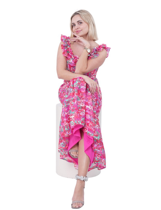
5. Pink Photographs Beautifully
This might be the reason women always say, “I love how I look in this photo!” when they're wearing pink.
Pink absorbs and reflects light in a way that is incredibly flattering:
- It reduces harsh shadows.
- It adds a subtle warmth to the skin.
- It brightens the eyes and softens expression lines.
- It creates harmony with natural backgrounds like sand, palm trees, blue water, or sunsets.
For travel photos — especially those taken in bright sun — pink is practically foolproof.
Think of that moment right before dinner when you take a quick photo on your phone. Pink catches the last golden rays and makes the entire image feel softer, smoother, and more vibrant.
Even in indoor lighting, pink performs beautifully. It doesn't wash out your complexion the way some neutrals can, and it doesn’t overpower the frame the way very strong colors sometimes do.
If you want your photos to feel timeless and luminous years from now, pink is your color.
6. Pink Is Timeless — Not Trendy
Some colors come and go. They have “a moment,” and then suddenly, they feel outdated in photos.
Pink isn’t one of them.
Look at fashion archives, holiday pictures from decades past, or editorial campaigns spanning the years — pink always finds a place. Maybe the shade shifts slightly from season to season, but the color itself stays relevant.
Pink has longevity because it isn’t built on the idea of trend.
It's built on emotion.
It feels joyful.
It feels uplifting.
It feels like celebration, femininity, softness, strength, and confidence — all at the same time.
This emotional resonance is why pink remains one of the most enduring colors in closets around the world.
And this timelessness is exactly why, when you look back at your photos five, ten, or fifteen years from now, pink still feels fresh, modern, and beautifully in the moment.